Change is terrifying, and few things in technology have a greater capacity to set us on edge than a fundamental reimagining of the Windows operating system–a piece of the PC that’s as vital to our lives and productivity as our mice and keyboards. But change is afoot, and Windows 8 is designed to play a pivotal role in Microsoft’s quest for relevance in a future awash with touch-centric devices.
I’m a big fan of Windows 8. The Metro UI is a breath of fresh air, and the Consumer Preview has given Microsoft an excellent opportunity to make headway in changing perspectives on where it is headed with Windows. The preview also gives Microsoft a chance to listen to feedback from users, and get things right in the final product. (For a less upbeat appraisal of the Consumer Preview Windows 8, see my colleague Ed Albro’s article “Windows 8’s Metro UI: 7 Things You May Just Hate.”)
There’s considerably more to Windows 8 than an aesthetic overhaul. Metro’s modern approach to interface design brings Microsoft’s operating system into line with the touch-centric devices that have taken center stage in our lives. Applications are readily accessible and serve up useful information without forcing users to rely on shortcut icons or third-party applications. Gestures make getting around the PC faster and more efficient–and they work just as well for keyboards and mice as they do for the touchscreen devices they’re designed to accommodate.
My initial impressions of the OS are generally positive. It still has some rough edges to smooth out, and it’s daunting at a glance, but Microsoft’s vision of computing without compromises is sound.
Windows, Your Way (Mostly)
Nevertheless, the desktop undeniably takes a back seat to Metro.
In Defense of Different
Metro isn’t just pretty: It’s efficient and supports considerably faster navigation than was possible with earlier incarnations of Windows.
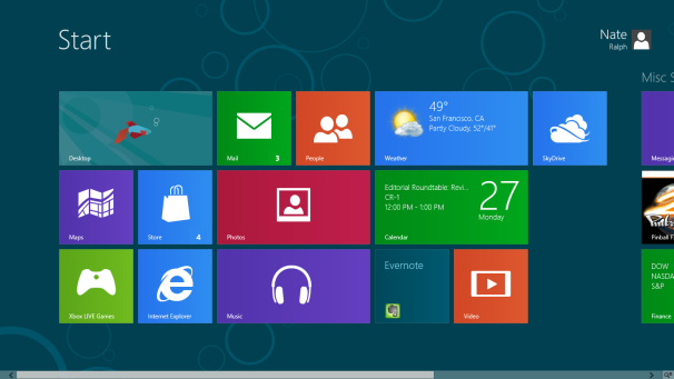
The large, unwieldy tiles that dominate the screen may be a bit disorienting at first, but think for a moment about the Start menu that we’ve all grown accustomed to. It’s a mess: a thin, staid list of apps and folders that necessitates either cramming the Taskbar with apps that you use often or cluttering the desktop with a sea of shortcuts.
Metro takes that clutter and makes it a little more aesthetically pleasing. But there’s more: You can easily group and shuffle applications. Windows has always supported the possibility of having your apps at the ready, but being able to silo them into cliques greatly simplifies the task of finding what you actually need to use.
Information is king, and Metro’s live tiles–which can display dynamic content–are a crucial piece of the puzzle. The Mail app will display a few of your recent email messages; Calendar will show upcoming events; and the Photos app will cycle through images that are connected to your Windows account. Few apps currently available in the Windows 8 store take advantage of this functionality, but being able to have useful information within easy reach is a wonderful step forward. Live tiles function identically to Windows Gadgets, which many users have already set up on their Windows machines; but giving app developers a way to make their applications informative without having to develop an individual widget is a positive step.
Then there’s search. Can’t find the classic Control Panel, or a particular file? When you’re on the Start screen, just start typing–the search dialog box has been around for a long time, but getting where you need to be has never been this fast and easy.
Getting Over the Learning Curve
Metro’s gestures certainly take a bit of getting used to. To get started, you’ll need to understand three important elements.
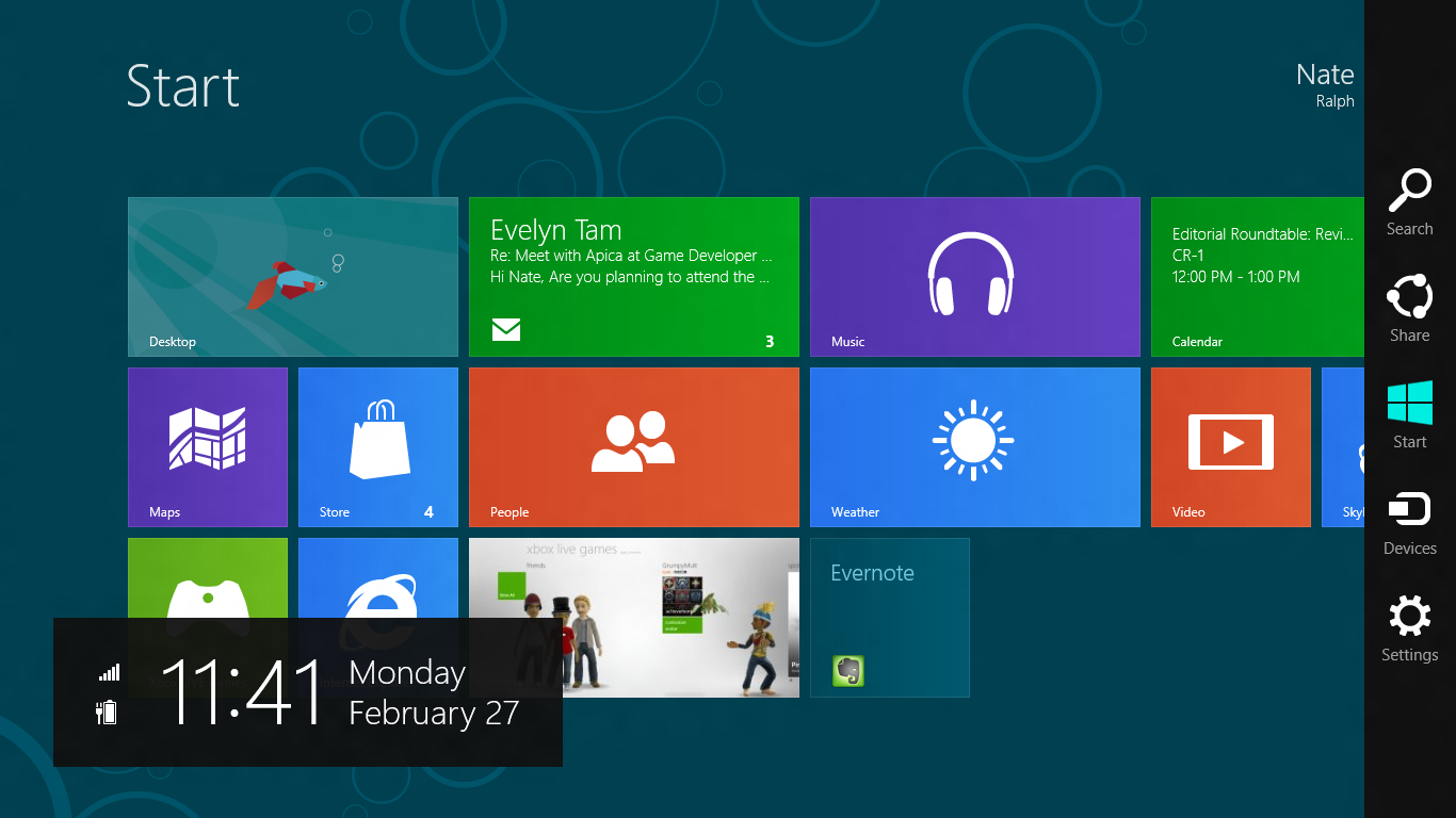
The second important element is the left side of the screen. Hover over the upper or lower left corner, and a list of all currently running apps will appear. Or you can press Windows-Tab to bring this menu up; if that method annoys you, you can use Alt-Tab, which works just as it always has.
The third crucial item is the right-click context menu. The dropdown menu that trails your pointer doesn’t make much sense on a touch-centric interface. So instead, right-clicking on empty space in an app brings up a bar at the bottom of the application that contains traditional context-menu features.
This context menu bar will be the trickiest piece of the Windows 8 puzzle to get used to. Drop-down context menus haven’t vanished entirely: Right-click a link in Internet Explorer, and you’ll get the familiar options. But it will be up to developers to parse user feedback, and make design decisions that make sense.
A Chance to Get Things Right
There are quite a few things wrong with Metro, as it stands in the Consumer Preview.
Multimonitor support is lacking: Clicking on the traditional desktop automatically switches Metro to a traditional desktop, which can make multitasking a pain. Clicking anywhere on a desktop application will flip the Start screen on the other monitor away to show whatever Metro app was last running. This quirk ought to be easy to fix: Clicking on screen 2 should never change what is displayed on screen 1. Some gestures don’t work as smoothly as I’d like, particularly when dragging and shuffling apps around is involved. And I’m not sold on full-screen apps: they make sense on small screens, but I’ve grown accustomed to the expanded real estate on larger monitors; empty space abounds in Windows 8, and it feels wasteful. Alleviating this problem depends to some extent on application developers paying better attention to how their apps behave on large PC montiors.
But that’s the point of the Consumer Preview: to get the future of Windows in front of users so they can tell Microsoft what needs fixing. I’ve already seen dramatic improvements in the OS since I began futzing with the Developer Preview back in September. Now that everyone can get their hands on Windows 8, glaring user interface issues will surely be brought to light, so Microsoft can fix them.
Windows 8 is still a long way out, but this Consumer Preview is an excellent first step toward getting people ready for it. Though changes will continue at a rapid pace, there’s no better time to download the Windows 8 Consumer Preview yourself, and let Microsoft know what works for you and what doesn’t.